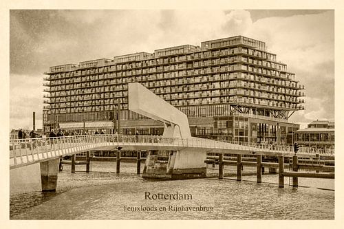
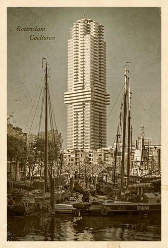
Vintage Rotterdam
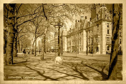
Take a good look at this vintage postcard of the White House and the Old Harbour in Rotterdam. An old picture, found in a cardboard box that has been in a cold and humid attic for decades. Let’s try to date it.
Fin de siècle
Er, did I hear you say fin de siècle? I assume you mean the end of the nineteenth century. That sounds like a valid assumption; the White House, the “American” skyscraper that for years was the highest in Europe, dates back to 1898. And the classic barges in the foreground, located in the Oude Haven, support this hypothesis.
But what are those huge towers that loom up behind the White House? And what is George Clooney doing there on that huge poster?

Photoshop
Okay, I’ll admit it. This is not a vintage postcard, but a recent digital photo, artificially aged in a bath of Photoshop. In recent weeks I have made a nice series of these kinds of images, which make you look at present-day Rotterdam in a different way.
Allright, so there’s a button in Photoshop for this kind of jokes? No, it is not as simple as that. There are plug-ins that get pretty close. But I think it’s much more fun to play with filters and other adjustments yourself.
Sepia
The first step is to adjust the color. Usually one of the presets in the window Image> Adjustments> Black & White, with the option tint checked, creates a cool sepia look. In some cases, one of the presets from the Image> Adjustments> Color Lookup window, simulates the somewhat limited color palette that you often see in old color photographs.

Filters
Next I try out some filters like Film Grain, Diffuse Glow, or Photocopy. With filters like Underpainting, Texturizer or Halftone Pattern I try to suggest a paper-like structure. However for all filters it can be said that if you apply them 100% they usually don’t make sense, but at for example 30% the effect is much more subtle.
Vignette
Old photographs often have a strong vignette and tend to be less sharp in the corners of the image. I imitate those properties with the Lens Correction and Iris Blur options. Then I add the white border that you almost always see on old postcards, with a transition between photo and white that’s rarely completely sharp.
Dust and scratches
To let the ravages of time do their work I add dust, scratches, stains and smudges, by placing grunge textures on top of, or underneath, the image and experimenting with blending modes like multiply, lighten, overlay and soft light.
For the finishing touch I apply a yellow filter (Image> Adjustments> Photo Filter), because paper has a tendency to become slightly yellowish over the decades.
This making of video summarizes the whole process:

UPDATE: a new series: Vintage Postcards of Rotterdam in the Twenties


